In the depths of meticulous attention that supported the exploration of my initial Anaglyph-a-GIF process this week, I managed to publish several pieces (to three different sites) with a glaring error in spelling in all of them. Introduced in an original source file and then copied across several versions, an incorrect spelling of Magenta smiled out at me through multiple stages of the production process. It was not until the end had arrived and I finally sat back from the screen, that I noticed the error. At that point, spent, I lamented to Melissa Techman (@mtechman), “As simple a fix as that may seem, it is buried deep in several files. It will wait until later. ;-)”
And waited it has.
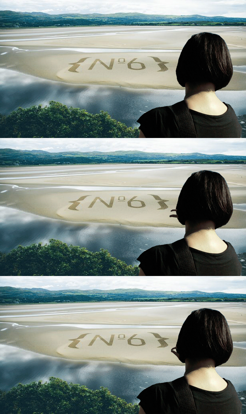
In the interim, urged on by the pleasure and satisfaction of exploring the process of creating animated anaglyphs (see yesterday’s post, “George Wither, page 8, ‘Boo!'”) from the illustrations the 1635 publication, Emblemes, Illustrations by George Wither, I have moved another image from static scan in PDF form towards a renewed piece of digital, interactive art.
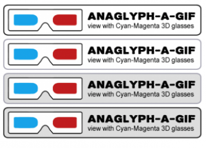
However, in preparing to share the result, and with the intentions of developing several additional pieces in the coming days, I revisitied my earlier files with the intention of adjusting the spelling error. I was unhappy with the pixellated text output from photoshop, and so I fiddled in Illustrator and Fireworks to find a better result. Deciding that the “view with Red-Cyan Cyan-Magenta 3D glasses” notice needed to be perceived as being separate from the art piece itself, I also experimented with the font, the glasses image, a border, and some colour schemes.
Badges for 3D Art Pieces
In looking to review the badges in the context where they will potentially viewed, I decided to compare them in a web browser, and shortly thereafter, this post was done.
My thoughts:
- The black border conflicts with the black outline of the glasses in versions 1.
- A grey border reduces the conflict, and de-emphasizes the border.
- A grey background helps the badge to stand out from a white background colour.
- The black border with a grey background isn’t so bad as the white.
- I’m not 100% sold on the bold font as it has a slight distressed character that looks a bit fuzzy at this size. We’ll see.
In the end, there will be a plain “Anaglyph” badge for static 3D images, and an “Anaglyph-a-GIF” badge for animated 3D images. I think I’m tending to go with this design. Input?
Mariana Funes (@mdvfunes) has this afternoon started to collect the George Wither GIFs in a #4life Jux gallery. You can also see more curated by MBS (@mbransons) and Ryan Seslow (@ryanseslow) on the GIFfight tumblr.
——
July 26th NOTE: Subsequent to publishing this post, I have poked around a little bit more into 3D glasses and have decided that the lenses should be identified as Red-Cyan. So I’ve edited the badges and will adjust as necessary.









Recent Comments