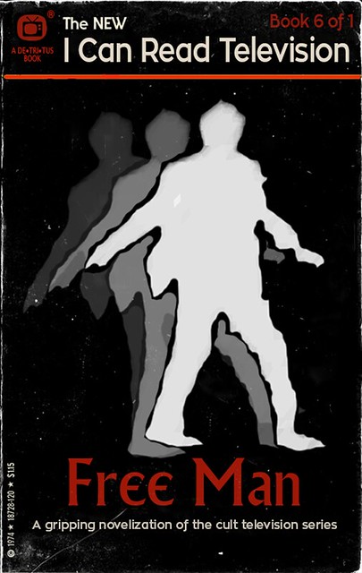
The Inspiration
@cogdog (Alan Levine) inspired me this morning with his I Can Read Series: Eye of the Beholder children’s book cover, and upon quick reflection, it seemed to be a just perfect assignment to do for poor Henry Bemis in Time Enough at Last. The labelling of this book as a shared reading book makes it all the more poignant for poor, all-on-his-lonesome Henry.
The Process
I gathered my I Can Read series banner from a basically white-covered book Pete the Cat, which made it easier to isolate the banner using the Magic Wand Tool and there by erase the rest of the cover using the Eraser tool. In the end, I removed the existing drop shadow from the banner (also using the same process) as it was somewhat pixel-ly and distracting.
I toyed around with a few different fonts for the title, before settling on a simple, kid-friendly sans-serif Trebuchet MS at 47 pt for the title and 11 pt for the “authors.” I just eyeballed the font sizes with the slider to get something that seemed to look good.
Although I had originally planned on using an image of Burgess Meredith with the broken glasses, it was bit too difficult to get a tall enough book-propotioned crop that also showed books in the background, and so I moved ahead a number of frames to where the camera pulled back and it was easier to select a more vertical image.
I considered titles like “Henry Bemis,” “Poor Mr. Bemis,” before deciding that for a children’s book (and especially a shared reading book!) there needed to be a very clear connection between the topic of the book (the man is sad) and the title, hence “Mr. Bemis is Sad.”
The why of his sadness is our inside joke, as viewers of the episode. And including the book in the I Can Read series is just the icing on the cake.
Submitted, for your consideration, as a candidate for Design Assignment 55: I Can Read Movies (where an episode, is like a movie, in The Twilight Zone ….)
In looking for a film to fit into the I Can Read Movies assignment, I decided would start by repurposing my initial Monkey House vector graphic and work with Terry Gilliam’s 1995 film, 12 Monkeys. Like Gilliam’s 1985 film, Brazil, the film is set in a dystopian future, but also introduces the wrinkle of time travel. Visually stunning and mind-bending, the film is worth viewing if you haven’t seen it.
I decided to work at extending my skills using Illustrator by trying to recreate the graphics template from the original book series. While that was easily doable, the further task of “aging” the book put a bit of a crimp in my timeline. I tried following the Photoshop tutorial by MOME, but struggled to get the right textures, and so, in the interests of time, I sought out some aged paper textures on the Internet, and eventually settled on Old_Scroll_Texture_II_by_Isthar_art, going back to Illustrator to get a partial effect. Unfortunately, of necessity, the layering put the effect under the text, so the text and images on the cover don’t really look aged to match the paper. However, as I was getting ready to post this, I decided to go back and try the tutorial once more, and managed to figure it out in Photoshop. Maybe I was sleepy the first time!
So here are two versions. First the Illustrator-only version, and second, the fiddled-with brushes-in-Photoshop version.
However, in doing a bit of research into the movie, I came across an amazing antecedent for the film, discovering that Gilliam’s film was actually a re-make/re-imaging of a quirky black and white still-motion sci-fi film from 1962 by Chris Marker, entitled La Jetée.
Searching online revealed a section of the film. Check it out.
Cool, eh? If there isn’t already a ds106 video assignment focusing on telling a narrative like this using using still images, there should be. This film produces a wonderful result. It’s reminiscent of the missing sections of Frank Capra’s 1937 Lost Horizon that have been replaced with existing promotion stills (to accompany the remaining audio track). It’s an eerie effect. And quite dramatic. It creates an interesting space for you to fill in some gaps on your own. Maybe I’ll aim for something like that when we get to video…
Now, as an add-in bonus, while searching for existing images for 12 Monkeys, I found this:
I’ve been looking for a film to explore the cinematic animated GIF assignment, Say It Like Peanut Butter. Perhaps I’ll take a further look into 12 Monkeys…
And, if that weren’t sufficient monkey-related input for summer reflection, my copy of our Camp Magic MacGuffin Monkey House name inspiration arrived recently in the mail.
Read on, Monkeys and campers! Read on!!
Recent Comments