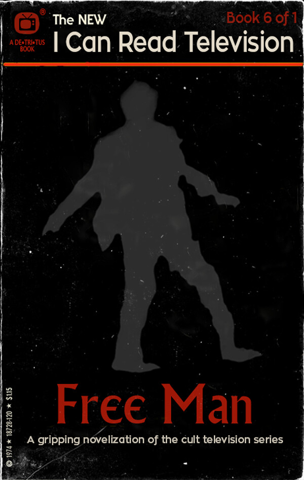
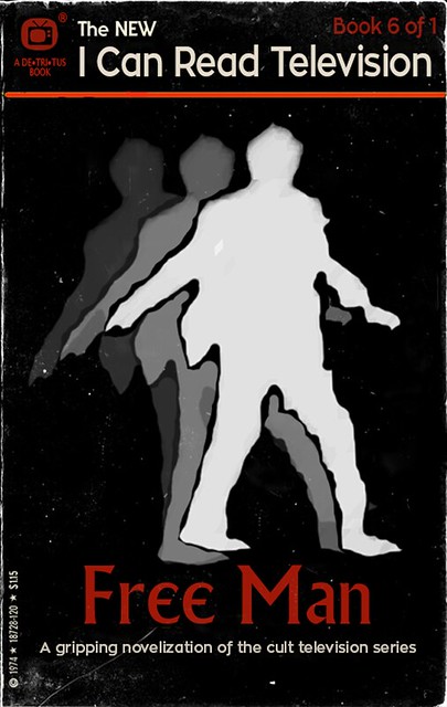
“I Can Read Television: Free Man 2” by aforgrave on Flickr
I like the “I Can Read Movies” Design Assignment 55. It’s fun to try to capture a movie (or television show) with a cover image as well as imagine the design of an old paperback book.
The Basics
- This book cover is based on the Spacesick’s Jurassic Park rendering — I liked the black background and roughed edges for my Prisoner book.
- I font matched the “I Can Read Movies font on whatfontis.com with a close match Zona Pro, and used that to re do “I Can Read Movies” to “I Can Read Television.”
- To deal with the movie-to-television switch, I sourced and licensed an icon of a Television on The Noun Project by John Caserta and updated the logo and publisher branding in the upper left corner.
- In conjunction with the logo revision, I switched the colour scheme from yellow/black to red/black.
- Giving the book a 6 of 1 numbering seemed appropriate.
- The teaser beneath the title was re-written, and the title redone (using the Village font) to Free Man. I think “Free Man” perhaps communicates a wider and appropriately more open-ended set of messages for the show than just “I am a Free Man.”
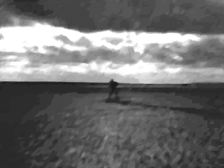
The Cover Image
“MiniFilm2,” animated GIF by @aforgrave
The trickiest part of this particular book cover was getting a silhouette image of Number Six on the beach during his “I am not a number, I am a free man!” speech. Although I somehow have a fairly good idea of the physical movements he goes through at that moment, it’s surprising how poorly lit that sequence is. I tried four times (from different sources, too) to capture frames that I could use.
I’d had a run at enhancing this sequence once already when I tackled “Google Says … I am Not a Number” last week. It might be easy to miss in the original GIF, but there is an excerpt of the whole opening scene hidden in the search results at the end. In working with the frames from the defiant speech, I had to significantly adjust both the brightness AND the contrast to get something useable.
So in working to get a silhouette of Number Six on the beach, I again went back and tried to adjust brightness and contrast.
I tried adjusting brightness and contrast manually, frame by frame, in Photoshop. Labourious work, and I wasn’t pleased with the results. I needed more frames to work with than I’d originally grabbed.
I went back into MPEG Streamclip and tried exporting at 24 frames per second rather than the 6 per second I had previously used. Unfortunately, that didn’t give me any better silhouettes than the ones I’d had before, just more of them.
MPEG Streamclip allows you to select the colours or shades of grey in the images that you export. I tried 256 greys, as well as 16 greys, hoping that it might give me a good silhouette separate from the background. Unfortunately, that is the real problem with what has been shot — not enough light and not enough contrast. Two few greys didn’t give enough detail. Too many greys and there wasn’t enough distinction.
MPEG Streamclip also allows you to adjust brightness and contrast during the export process. Good to know, but the first time I ramped the brightness right up (as I did in Photoshop on a frame by frame basis) I just got a whole bunch of white frames. So I had to experiment there, too.
In the end, although I am not really happy with the result, I wound up with a series of frames to which I applied a Filter (Brush: Dark Strokes) that resulted in the following animation.
“Free Man,” animated GIF by @aforgrave
I selected a frame from towards the end of the sequence after the throw, where Number Six stands staring back at The Village. In the interests of time, I went with that frame — inverting it to make Number Six light and then doing a free-hand tracing around the ragged silhouette in black. I then erased all but the black-outlined silhouette using the eraser tool and placed it on the black background.
You can see the original colour of the silhouette below (the lightest, front-most one, with the black outline). Still experimenting, I added a couple extra copies with decreasing transparency, rotating and offsetting them to suggest a jarred, out-of-place character, and in the end, went with the just the third (greatest opacity) silhouette only.
“I Can Read Television Free Man 1,” by aforgrave on Flickr
I may still return to the beach scene to continue to explore methods to refine the quality of that image, but for now, it is time for other things!


Recent Comments