
The Daily Create, tdc2007 offers up the Google Data GIF Maker as a tool for visualizing (and GIFfing) some data.
BEWARE!! The Data GIF Maker is not (yet) worth using to make a respectable data GIF.
When the Data GIF Maker first came out a month ago, I was intrigued and tried to get it to work. But the more I worked with it, the less impressed I was. While it generates something that looks nice, it does a VERY poor job of accurately visualizing data. Essentially, regardless of the data provided, it just wobbles back and forth and then stops with a 80:20 split in favour of the larger value. By way of proof — the GIF above was generated with data values of 99:1 — values which are in no way represented by the GIF produced. Despite what the interface may imply (values, comma-separated) it really only “compares” the two data points — all those fractional percentages shown during the wobble are made up and are completely non-existent in the real sense of the data. The final visualization of the actual data — 99% versus 1% — is completely bogus.
If you want to read bit more about it — check out the two posts I wrote on my edVisioned.ca blog:
and
Note that following on Alan Levine‘s (@cogdog, on Twitter) example of signing up for MOOCs and then allowing engagement to lapse, I did sign up for a MOOC on Data Visualization for Journalists back in 2012 (the mention of GIFs in the syllabus caught my eye) offered by Alberto Cairo (@albertocairo), and so I tagged both him and Simon Rogers (@smfrogers) from Google News Lab via Twitter in my second post to see if either could respond to my concerns about the misleading/misrepresentation offered by the current Data GIF Maker. It seems to me that if journalists are going to be visualizing data, it needs to be accurate and clear about what it is intended to be doing.
Here is our very limited exchange on Twitter — and sadly, no comments for either blog post.
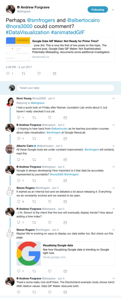
Based on my findings and their very limited replies, I say stay away from this thing for now. It’s not even worth the wait it requires (several minutes) to generate a GIF.
Make a Data GIF on your own (using Photoshop, say) and know that you can accurately represent your data and communicate what the data means.

















Recent Comments