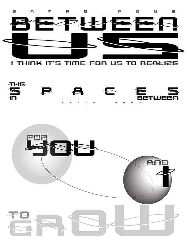
The Lyric Typographic Poster design assignment asks that you choose one of your favorite lines from a song and illustrate it using only typography. “Consider how the font, color, sizes and placement of the typography can reflect or emphasize the meaning of the words.”
I’ve been meaning to use this lyric for the Lyric Typographic Poster design assignment for a long time now. When I first thought about doing this assignment, this lyric jumped to the front of the queue as having a lot in it that could be represented in a typographic poster (the concept of spaces between was the clincher, I think). The illustrated text is the second half of the chorus.
When design week came around this time, I decided I would hunker down and do it. Shortly after getting an overview of the week’s preferred assignments, and with the classic Rush song making one infinite loop in my iTunes, I started working on this. For the font, as a reference to the idea of planets and orbits, I chose the free font Outer Limits by Shyfonts (extended upright version). Perhaps I should have selected some kind of paper texture or colour for the background, but by the time I stopped working on this that day, I was feeling stuck, and not sure how to proceed. I know it could be better, but I wasn’t feeling how to move forward, so I just put it aside.
Now, a few days later, I look at it, pull the planets back from their hidden status, and decide to push the post button. The white background works for now. Its emptiness supports the sense that there is nothing between, leaving space. Mustn’t fill it in.
There is always another time. The lyric will remain. The inspiration for revisiting this poster will come from within the space between this incarnation, and the next.
Entre Nous
by Rush
From the 1980 album, Permanent Waves
| Verse We are secrets to each other Each one’s life a novel No-one else has read. Even joined in bonds of love, We’re linked to one another By such slender threads.Verse We are planets to each other, Drifting in our orbits To a brief eclipse. Each of us a world apart, Alone and yet together, Like two passing ships. |
Chorus Just between us, I think it’s time for us to recognize The differences we sometimes fear to show. Just between us, I think it’s time for us to realize The spaces in between Leave room for you and I to grow.Verse We are strangers to each other, Full of sliding panels, An illusion show. Acting well-rehearsed routines Or playing from the heart? It’s hard for one to know. Chorus (repeat) |
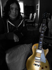
| If you watch this video, you will see Alex Lifeson playing a Les Paul Gold Top — which has a nice connection for me, as it was my eldest son’s choice when he purchased his first guitar after his 13th birthday. | ||











Cool! What did you make it in? It looks very slick. Nicely done.
Illustrator. I started working with it last spring when it became necessary to get serious about some quality print-ready graphics for ECOO2012, and have been flipping back and forth between it and Photoshop the last few months, depending on the type of project. I used to use FireWorks the most because a lot of what I was doing was for the web (it’s nice for transparency, vector graphics, and .png files), but it’s not the tool for print or high resolution. Since ds106 came along, I’ve been working in more of the different tools, depending on the task.
I was going to do this particular lyric a year ago, but never got around to it. (However, I did make one of those for Yoon (@DoremiGirl) yesterday — just using Keynote on my iPad — and kept a copy for myself)