 I’m doing a little experiment this evening — pushing myself to see if I can reach 10 stars worth of assignments before midnight for this week’s feature The Twilight Zone episode, The Invaders, — making an attempt to maintain a decent level of quality and also peruse the Assignment Bank for interesting challenges that will fit the subject material. I am going to give myself 5 stars towards The Invaders for GIFs already completed (You Best Clear Offa My Roof, and my poster + mini-GIF for the Episode of the Week This Week on ds106zone: The Invaders) — and I am going to seek out work that will NOT evolve into GIFs for the next couple of hours …
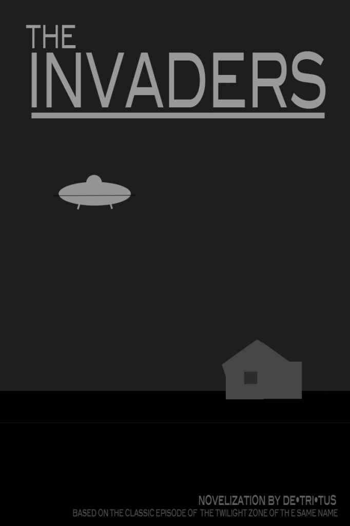
First I’m taking a run at former UMW #ds106 student Nancy Belle’s (@bellekid) Design Assignment 960: Minimalist Book Cover.
In approaching this assignment, I decided on a primary dark cover (the episode is quite dark, taking place at night and with minimal lighting), maintaining clean lines with a simple san serif text, and building the limited images out of existing primary shapes within photoshop, going with shades of grey to complement the black. (The episode was shot in black and white anyway!) . While my original plan was to place the saucer on the roof, and include a silhouette of the giant lady holding her knife through a window in the hut, I decided to simplify things and only show the saucer in the sky, and the hut on the horizon.
To balance out the larger title text at the top, I added an author line and a “based on” reference line at the bottom — keeping the lines of the text long and linear, and thus hopefully low-key. Each was reduced to 40-50% Opacity so as to not stand out in relation to the title and the other two images. I also applied a reduced opacity to the 95% grey rectangle that provides the “sky” — trying to find a shade of grey that suggested a dark sky without being too light.
In hindsight, I might like to see how this would have turned out with a non-primitive constructed hut — something that might more accurately reflect a curved, sloping roof slightly slanted walls — but my timeline is calling for compromise — and I need to keep this minimalist. And as I take a final look at the image before posting, it would be nice to go with a gradient of lighter to darker grey for the sky as you move upwards — suggesting some light in the distance on the horizon, but fading to the dark of space as the eye rises. However, it is time to post.
As I look at the star count for this assignment, I think it’s a bit high — 3 1/2 stars for this, as opposed to only 2 stars for an @iamTalkyTina Twilight Zone animated GIF? I typically spend a lot more time on most animated GIFs than I spent on this.








I love the balanced design and the great write up of the thought process behind it. Awesome work.
Thanks, Mike!
As a ds106 Open Participant, I don’t always push myself to do all the reflection and documentation of process that is expected, but I’m somewhat intrigued by the challenge of getting 30 stars worth of visual and design assignments as well as taking some time to explore the Assignment Bank. Stretching to find 10 stars worth within The Invaders has also been a nice constraint.
I am just about to post my remaining stars for The Invaders, and have lucked into a nice solution that will be able to play out for the remainder of this wonderful #ds106zone Twilight Zone context. The power of the box in requiring you to think within (or defining the space that thus becomes “outside”) is not to be underestimated.
This is really great. The design embraces minimalism without being simple, with a subtle complexity. But what really strikes me is the quality of the gray tones and the way they match the tonal quality of the episode. Brilliantly done.
Hi Paul,
Okay! 🙂 “minimalism without being simple, with a subtle complexity” sounds like you are happy with the balance I was wrestling with during this process. That’s good to know!
Thanks for the compliment on the greys (grays) —- sometimes I go mathematical and adjust things for emphasis based on relative percentages in the Opacity slider, and other times I eyeball them. I was surprised to find that my “eyeball” approach had me sliding the Opacity way down into the 40% range to get a decreased emphasis, as my initial numbers would have been maybe 70%. Maybe I’ll internalize that as a new awareness when doing minimalist black & white / greyscale design as we move forward. I certainly find that these old Twilight Zone episodes are providing a fun opportunity to work without colour.
Maybe that would be a neat assignment — colourize a Twilight Zone still for emphasis and fun! Hmmm. Might provoke a purist backlash. From me, too. Having second thoughts. 🙂
What I love about this is that it feels like an Atari 2600 video game….which actually give me an idea. Your stuff has been so fun to look at, and so tight conceptually, it is nothing short of awesome to watch someone in the groove, and Paul Bond has been in a similar place these days, his recent animated GIF of “The Lonely” that he links back to this post from is amazing as well. So good!
http://blog.raptnrent.me/2013/05/26/the-colorized-zone/
Man, you remind me of some unfinished RIFF-a-GIF work from back in December during GIFestivus– Ben Rimes did an animated GIF riff on your Atari Game assignment, and I spent considerable time making some alternate characters to substitute into his GIF — and then I never finished it. I have so many unfinished GIFs, it’s not funny.
The positive is that they are still available to be finished — the possibility still exists …